Visual Analysis: Wakarusa and Harvest Music Festival Posters
- Isabella Schlicker
- Sep 17, 2018
- 8 min read

Updated: Nov 26, 2018


Visual Analysis: Wakarusa and Harvest Music Festival Posters
In the past decade, pop culture has introduced music festivals as a trend of sorts; all the most popular and famous celebrities attend these festivals, with one in particular being the most adored: Coachella. But music festivals are becoming more and more popular today with clothing stores now releasing clothes and accessories, during the Spring and Summer time which is considered to be “festival season,” that are designed specifically for music festivals. Today’s youth are targeted as avid festival junkies with things like festival makeup tutorials, neon colored jewelry and accessories, and tie-dyed clothes becoming abundant in pop culture. Music festival posters are a common collectible item for these festival-goers, and this essay will be examining The Harvest Music Festival poster of 2014 and the Wakarusa Music Festival poster of 2015 (Figure 1 and Figure 2). The two posters hold differences and similarities in both design and layout, as one calls on an older audience and the other on a younger audience. They both employ pathos and ethos, sometimes at different levels. As Richard Buchanan states, “… design employs rhetorical doctrines and devices in its work of shaping the products and environments that surround and persuasively influence our lives to an unprecedented degree” (5). Both music festivals took place at the same location and are now both discontinued.
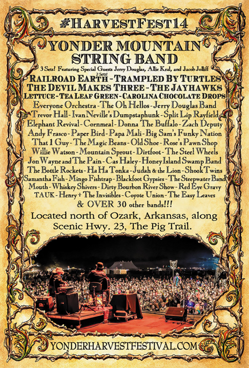
The Harvest Music Festival was a bluegrass festival for the most part. Its’ audience included mainly middle aged to older people, with some younger audience members. The 2014 poster for this festival has an overall yellow/brown/beige color to it, that almost looks like coffee-stained paper. This is to have a mellow effect on the audience as it was mostly an older crowd. The border on the poster is an artwork of brown vines with hints of red, yellow, and green in the corners. The vines give the audience a sense of nature, as the venue was outdoors, and the colors insinuate the reggae/Bob Marley feel which is relaxed. The vines are also simple shapes, and according to Arnheim, “Simple shapes can evoke the expressive qualities of suppleness or vitality or harmony” (10). All of the font is a consistent black color, to make the information easier to read.
The font for the top-portion of the poster has an organized, yet let-loose feel to it; it almost screams “bluegrass!” The font at the bottom, for the website, is very similar except it’s lacking the thickness of the other font. The location of the festival, which is in the middle of the poster, is an entirely different font, bringing attention to those words with a sense of formality. The top of the poster has “#HarvestFest14” which reflects the use of the hashtag on social media sites, appealing to the younger crowd. Most adults would probably just assume that it’s a regular “pound-sign,” but in pop culture the symbol holds meaning. Arnheim states that, “Any image is, of course, a particular thing, and by standing for a kind of thing it serves as a symbol” (3).
The bottom portion of the poster contains the website for the event in all capital letters. The rest of the space contains the lineup and location; the hashtag and the first eight bands are in bold, while the rest of the information is not because this information is the “hook” in a sense. This gives emphasis on the most popular bands and what is supposed to draw on the audiences’ attention. The main band, Yonder Mountain String Band, has the biggest font size, the hashtag being second biggest, and then the other seven, bold, bands being third in size. The rest of the lineup is the same size font, and the location is a size very close to that of the website.
Between the location and the website is a picture from the perspective of the main stage looking outwards into the crowd, this gives the audience a sense of how large the festival had gotten, thus making it more appealing. However, if this poster did not have all of the textual elements along with this image, then the rhetoric and ethos of the poster would not be as well established as it is now. As Roland Barthes describes, “Today, at the level of mass communications, it appears that the linguistic message is indeed present in every image” (5). The designers could have chosen an image that was taken in the daytime, but instead they chose one that was taken at night, and the stage has that similar brown color in the photo; the details of the image pull on the pathos of the audience by adding the overall feeling of “chill” to the poster. In the end, the Harvest Music Festival poster is visually effective as it draws in its’ older audience members with the design and layout, while also drawing the attention of the youth with the use of the hashtag symbol from pop culture.
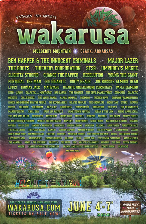
The poster for the Wakarusa music festival is much different from that of the Harvest poster. Waka drew in the younger audience members almost entirely, as the music was mostly EDM with some bluegrass at the smaller stages. This poster is extremely colorful, uses up all of the space, and it contains numerous design elements from pop culture. The poster is consistent in its design, as James Porter and Patricia Sullivan explain, “Design consistency refers to the basic patterns throughout a document, to the repeatability of basic page formats, styles and positioning of headings, and so on,” and it is important because, “it is thought that design consistency assists comprehension and memory” (2). With the poster containing heavy content and appearing busy, the design consistency gives the poster more ethos.
Three-fourths of the page is an outer space style, with the stars, the moon, and some comets. In the year 2015, the galaxy theme was very in-style in pop culture and due to this, using the galaxy design on this poster was an excellent use of pathos because the audience members can relate. The top portion is a red color, to draw attention to the name of the festival, and the colors from then on are subtler so that the audience can focus on the lineup. The bottom portion of the page is a pond with trees, and what most people are not aware of, is that the pond is actually the one that resides at the festival location, and it shows the familiar “Welcome to Wakarusa” set up that is there to greet the audience as they first enter the venue. Behind the tree line, from left to right, is the Ferris wheel, hot air balloons, the main stage, and some other aircraft. The Ferris wheel and hot air balloons are there at the festival as activities that people can pay to participate in. These images draw on the pathos of the audience, as Buchanan explains that pathos for the designer is “to incorporate features that appeal to specific groups of individuals,” and the images are doing just that as they appeal to the younger audience members (13).
So, for this poster the font color choices are mostly light colors, as to contrast against the dark background. Wakarusa is in a green color, while the lineup of the bands is in more of a lime green. The location at the top is in two different colors, which I think is a poor choice because “Mulberry Mountain” almost blends-in with the lime green color of the bands. I think making it the same red color as “Ozark, Arkansas” would have been a better decision; here the poster is lacking in design consistency and therefore hindering comprehension capabilities. Now, at the bottom the ticket and website information is in a dark grey box, drawing attention to itself, but the information is in green, yellow, and red. Once again, we have play on the reggae colors and for this occasion, I think this choice is effective and pulls on the pathos of the audience. The date is larger, but also in yellow as to show awareness.
Right beside the date there is a “wooden sign” with a slogan that is trying to draw on the more “hippie” audience members. The slogan is “Where Music Meets Mother Nature,” and the message is straightforward which is an important key in having good design according to David Birdsell and Leo Groarke (3). Also, by doing this, the designers are trying to get a certain group of audience members to identify with the product and make it look desirable, and this is an effective use of ethos (Buchanan, pg. 14).
The font on this poster is far different than the one on the Harvest poster; this font is more rounded and bubbly which screams “youth” to me. The simple rounded shape of the font is less formal compared to that of the font for the Harvest poster, and I think this was an excellent choice by the designers because formality is typically not a concern for the younger generations. The only other font is on the hippie “sign” and that makes sense as that portion is trying to call on a semi-different audience. This poster has a lot of content and images, as Arnheim explains, “A highly abstract design that bears little or no obvious resemblance to its referent must be restricted to a unique application or rely heavily on explanatory context” (7). Overall, this poster is effective for its’ audience, but I believe there are a few places that could use some revision as it almost seems too busy, and without the lineup or other textual information the design would not have been as effective as it is now.
Posters are a crucial part in the marketing and advertising of music festivals; it can make-or-break the attendance and overall success. The design and layout of Figure 1 and Figure 2 were carefully thought out and organized and as a result, the posters have effective ethos and pathos. The colors and fonts coordinate with the appropriate audience members, and they also set the tone for the event; as Harvest uses more neutral and mellow design elements and Wakarusa contains colorful hues and busy imagery. The most important part of a music festival poster is the band lineup: people are going to want to attend a festival because of the music and for this purpose the design needs to be centered around that lineup and draw attention to the band names. David S. Birdsell and Leo Groarke delve into the explanation, “Words can establish a context of meaning into which images can enter with a degree of specificity while achieving a meaning different from the words alone” (6). So, the words can spell out band names, but the images are what establishes it as a music festival. The posters could not be as rhetorically and visually effective if they just had words on them; it is the textual and visual components put together that persuade the audience to attend. In this way, I believe that both posters are designed well and that they both met their rhetorical and visual expectations.
Works Cited
Arnheim, Rudolph. Pictures, Symbols, and Signs. Berkeley: U of California P, 1969. 135-144.
Print.
Barthes, Roland. Rhetoric of the Image. New York: Hill and Wang, 1977. 32-51. Print.
Birdsell, David S. Groarke, Leo. Toward a Theory of Visual Argument. The Journal of the
American Forensic Association, 1996. Print.
Buchanan, Richard. Design and the New Rhetoric: Productive Arts in the Philosophy of Culture.
University Park, PA: The Pennsylvania State University, 2001. Print.
Porter, James. Sullivan, Patricia. Repetition and the Rhetoric of Visual Design. Norwood, NJ:
Ablex, 1994. 114-129. Print.


Comments